Redesigning the banking experience for GenZ users
In this project we took up the challenge to redesign the banking experience.
by Teja Srinivas
Respnsibilities
The Timeline
UX , UI
Ideation
Prototyping
6 months
Challenge
Challenge the assumptions and limitations in the traditional banking experience.
Questions we asked
Along with some workshops the sentiment of the team who had spent years in banking. Some questions that emerged from that period:
-
Why doesn’t every transaction have a timestamp, a merchant logo?
-
Why are all my payments to a particular person not grouped?
-
Why isn’t it easier to pay someone I’ve paid before?
-
Why am I sitting on hold on my phone to resolve an issue?
-
How can saving money be fun and engaging?
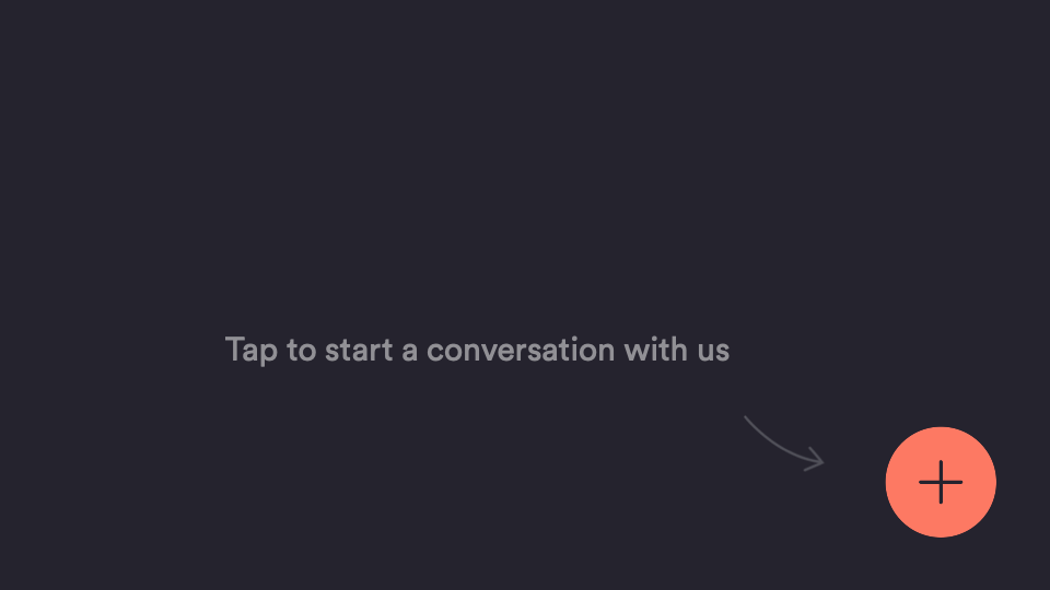
Making feedback easy
Other than user testing. We had employed techniques that are faster and easier to get around. We had a talk to us section where we got 60000 plus ideas from our users.
Designing for an Upsider
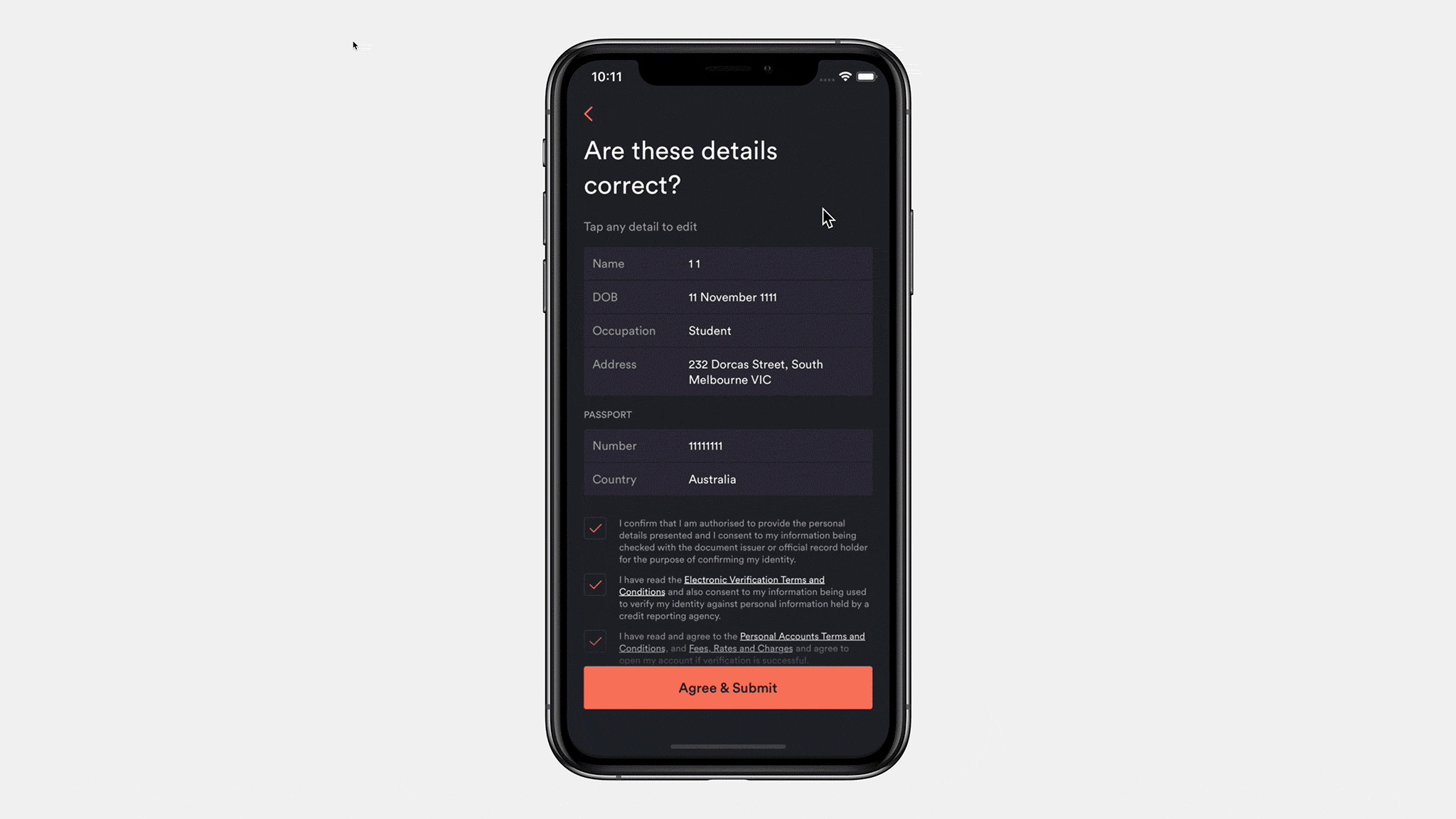
.Before we could even get that far, we had to solve the huge problem of enabling people to sign up for a bank account without leaving the comfort of a mobile app — something that had not been done before in Australia.
We knew that the sheer amount of information we needed from the user was going to be a challenge. Banking is highly regulated in Australia, so we had to cater for many types of identity data (passport, license etc). Most apps can get away with just asking for a username, email and password.
Mobile flows tend to be atomic with a single input per screen, so with identity verification we were anticipating quite a long flow. Our focus was to trim the fat wherever possible, not just by reducing the total number of screens but also by making it easy for people to understand what was being asked of them as they progressed.

We fought to reduce the amount of data we needed to collect. Why does banking need to know your gender? We cut it. Do you need your card sent to a PO Box? We’ll give you a contextual experience based on answers you’ve already provided rather than a scrolling form full of fields. As we tested the new flow amongst ourselves and with beta users from our waitlist, we made a few changes:
-
Anchoring buttons to the bottom of the viewport, and making them full-width. Close to your thumb and easy to hit.
-
Removing anything extra like images, so you could move faster without distractions.
-
Using conversational instructions (eg “What is your mobile number?” Instead of “Enter mobile number”). And only using secondary body text when it was really necessary.
-
Using example text for the input placeholder, so you'd know what the right info looks like.
Tweaks made to the signup flow
All of these small iterations reduced the cognitive load for users and made it feel easy and fast, despite the number of screens. This granularity was important as there isn’t actually a single sign up flow, but several which vary depending on your circumstances and the information we are required to collect.

So m any up yeah moments
So m any up yeah moments
Redesigning the nav bar


From that experience we learned that banking software can become quite large in surface area once you consider all the services offered. Tab-navs don’t lend themselves to being flexible and you can find yourself rearranging and regrouping items to fit a logical taxonomy. We also believe that the "hunt and peck" interaction while using tab-navs feels inelegant.
In contrast, the iOS home screen feels really usable when looking through your apps (and soon, widgets). Anywhere on the screen can be swiped, no aim required. This led us to create a unique but highly flexible and usable navigation concept. We could drop in sections as our services grew, and rearrange sections – or potentially allow users to – while being primarily gesture based.

Pull to save


Visualising savers
Initially we shipped Savers with a safe donut-progress ring to visualise the amount against the goal. Typically in banking, seeing your savings balance is a detached experience, a status check. Off the back of Pull-to-Save, our appetite for making saving fun and engaging became pretty big. We wondered if there was a way to feel how full your digital piggy banks are. We gravitated towards volumetric concepts over our existing perimeter progress bar.

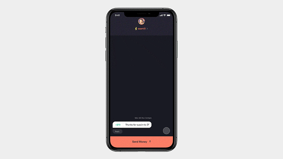
Social payments
We’ve previously touched on our belief that payments are a conversation and continue to iterate towards that vision. It's not about replicating social media features within our app, but rather understanding the why behind interactions in social contexts.
For instance, we often see users screenshot a confirmation screen as a way to prove they made a payment. We built payment replies in light of this, allowing Upsiders to very quickly give someone a thumbs up, react with any emoji or send a custom message in response to a payment.